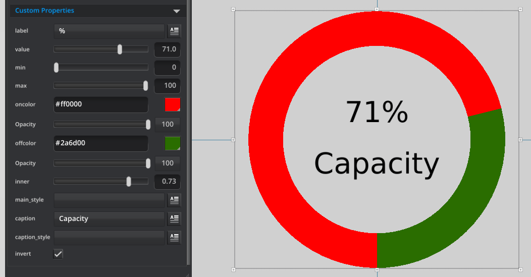
This control is going to enable us to display single values in a ‘donut’ style that has been popularized in many dashboarding tools. It’s like a cross between a pie graph and a fuel gauge.
Here is the source code for the component you can download and examine in more detail chart_donut_meter.zip

This component is created using the RenderKit hardware accelerated vector drawing and two text components. The code below shows how we can render wedges (slices of a pie) – but with an inner and outer radius. This is how we will draw the full and empty parts of our donut.
//renderkitShapeDoWedge(renderkit, shape_idx, x,y, inner_radius, outer_radius, startangle, endangle)
renderkitShapeDoWedge(rk, 0, width / 2.0, height / 2.0, radius * inner, radius, 90, angle)
renderkitShapeDoWedge(rk, 1, width / 2.0, height / 2.0, radius * inner, radius, angle, 450)
Our component will need quite a few properties for users to be able to control the labels, the colors and the scale of our values. The scale is important as not everything will be expressed as a percentage out of 100, but might need specific minimum and maximum values for out chart.
Here are the parameters for our component;
- string:label:%
- real:value:90:0:100
- real:min:0:0:100
- real:max:100:0:100
- color:oncolor:0xFF0000FF
- color:offcolor:0xFF000044
- real:inner:0.8:0:0.9
- string:main_style
- string:caption
- string:caption_style
- bool:invert
note : In version 2.0 we don’t have a style_picker property, so you have to type in the name of the style you want for the text. We are planning to add that in an upcoming release.
Hopefully the comments in the code you can download above make sense, but here is a quick note on one item which can be a little confusing. We have specified a scale factor for the font size here. All low level drawing elements are now driven by the same scale, think of these as a distance without a specific physical size. Essentially all components at the same scale will be comparable. This means the radius of a circle is a distance that is compatible to the font size (in this case the height of the font). So as long as we are inside the same component no matter what size it is made externally, it is totally valid to use proportional constants like this between the radius of the circle and height of the text.
//40 is a default radius size to compare the current radius size to.
//scale_factor is proportional to the size of the circle.
var scale_factor = radius / 40.0
setProperty(txt,"font_size", scale_factor * fntsize);