Overview
The getData and setData APIs allow you to gather databases stored in specific Components and alter the data as you please using setData in JavaScript code. This can be useful when creating custom components specifically. In this tutorial, we will walk you through the process of creating a Custom CheckBox Component using getData and setData.
There are three main use cases for get/setData:
- Get and set data from a map
- Special case: Get and set properties on the left panel of Umajin Mobile Editor.
- Special case: Get and set properties in a Form
Prerequisites
- Umajin Editor downloaded and installed.
- Any text editor.
- Completed the registerComponent tutorial.
Instructions
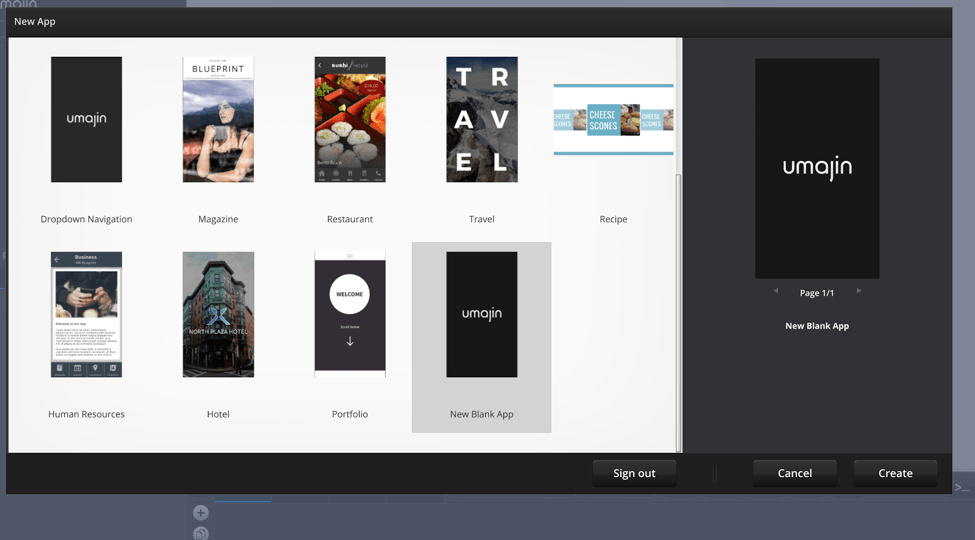
Step 1) Create a new blank project in the Umajin Editor to use as a testing platform for our Data-Driven Custom Component.

Step 2) Create a new JavaScript document and name it something that relates to your desired action. For our example, we will be naming the file checkBox.js because our goal is to demonstrate the use of getting and setting data to create the feature. Make sure that you save this file in the scripts folder under the Umajin Resources Folder.
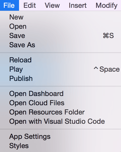
File → Open Resources Folder → scripts

Step 3) Now we can open up our JavaScript file, and register our Component. This step is described in greater detail in our registerComponent tutorial. We will call our Component “checkBox”. We will not have an icon for this example. The callback_init is called “checkBox_init”, the callback_refresh is called “checkBox_refresh”.
registerComponent("checkBox", "", "checkBox", "checkBox", "checkBox_init","","checkBox_refresh","imagepicker:checked:checkBox/checked.png,imagepicker:xed:checkBox/xed.png","");There are two properties that we add both of which are image pickers. This is so the user can select which image in the images folder they would like to use as the “checked” image and as the “xed” image. Our images, saved in a checkBox folder under Images, are added below.
 |  |
Step 4) Now we can create our checkBox_init function. This will be called when the Component is added to your Umajin page. The first line of code creates the image on the page. If the image exists, we get the image filename from the image picker property. This is our first call to “getData”. As you can see, getData takes in two parameters, the component object, and the key to fetch data from. We use “self” as the object to reference the current instance of our custom component. Following that, set the property of the image accordingly.
function checkBox_init(width, height){
   // create an image
   var ck = createComponent(self, "image", 0, 0, 100, 100);
   if (ck){
      var xed_filename = getData(self,"xed");
      setProperty(ck,"filename",xed_filename);
Now we have our first call to “setData”. Like “getData” this has references to the component object and key as the first two parameters. The third passes in the information data that will be set to the key in the component. In our case, it is the number 0 which will be used to provide the user with information as to whether or not the box is checked.
setData(self,"value",0);
The final line of the if statement registers for the On Press event. In basic terms, when our component is clicked on by the user, the “checkBox_on_press” function will be called. This function will be written next.
      bindEvent(ck,"on_press","checkBox_on_press");
   }
}
Step 5) Write the function for the On Press event. For this event, we want the two images to toggle. This means that if the box has an “x” in it, we want to see a check after clicking, and vice versa.
We will first declare two local variables. The first will hold the parent of the component, which will be the component itself rather than the image. The second will use “getData” once more to extract the value associated with the parent component.
function checkBox_on_press(){
   var parent = getComponentParent(self);
   var val = getData(parent,"value");
To properly set the data, we first need to check the value of whether or not the box is checked or xed. If it is currently xed, meaning it has a value of 0, we will get the filename of the checked image property, and established that as the image display. It is important to also then update the value associated with that component to “1” for “checked”.
if(val == 0){
   var checked_filename = getData(parent,"checked");
   setProperty(self,"filename",checked_filename);
   setData(parent,"value",1);
}
The else statement takes care of the other case. If the box is checked, switch both the image and the value to that for xed.
   else{
      var xed_filename = getData(parent,"xed");
      setProperty(self,"filename",xed_filename);
      setData(parent,"value",0);
   }
}
Step 6) If you would like to test out the Custom Component by adding it to the Umajin Dashboard at this point, feel free. You will notice though, that the images that you select for the “checked” and “xed” properties will not appear or update until you run the application. To fix this, we will write our refresh function. This looks almost identical to the function written in step 5, but the values are not affected. Additionally, we are only dealing with the image rather than the complete component, so we reference the child rather than the parent.
function checkBox_refresh(){
   print("refresh");
   var ck = getComponentChild(self,0);
   var val = getData(self,"value");
   if(val == 0){
      var xed_filename = getData(self,"xed");
      setProperty(ck,"filename",xed_filename);
   }else{
      var checked_filename = getData(self,"checked");
      setProperty(ck,"filename",checked_filename);
   }
}
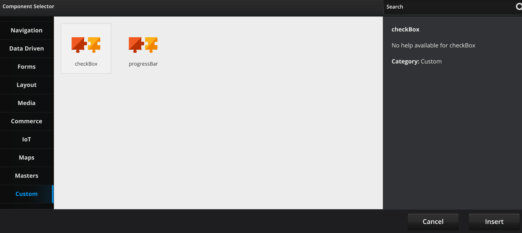
Step 7) Set up the Umajin Editor for testing. First, make sure that your JavaScript file is saved under “scripts” in the Resources Folder. After refreshing the page, click on the big plus button next to the name of your project. Click on the “Custom” tab and then insert your custom checkBox.

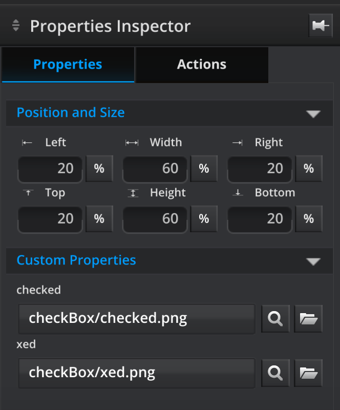
Step 8) Go to the Properties tab to select which images you want to use for when the box is checked and for when the box is xed.

Step 9) Now you can test your new checkBox component by pressing the play button in the Umajin Mobile Editor.
Note: If you put this in a simple form and setData “value” as we have in this tutorial, one or zero will be passed to the form.